Choosing the right paint colors for your home’s exterior is more than just a matter of aesthetics. It’s a decision that impacts the home’s curb appeal, its value, and even how it harmonizes with the neighborhood. However, certain colors can detract from your home’s beauty and may even lead to unwelcome consequences over time. This article explores various paint colors you should think twice about before painting your house, helping you avoid common pitfalls and maintain an attractive and valuable property.
Contents
Flashy and Unconventional Colors
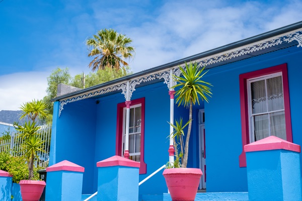
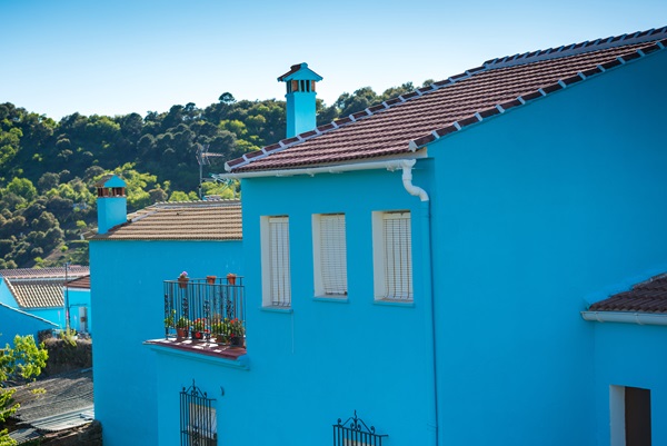
Opting for a flashy or unconventional color for your home’s exterior can create a visual shock that detracts from its appeal. Bright, saturated colors that might seem energetic can appear overwhelming when applied to a large surface area like a house. These colors can clash with natural surroundings and disrupt the cohesive look of the neighborhood. They often lead to regrets as the initial charm wears off quickly, leaving the homeowner with a color that stands out for all the wrong reasons.
The use of such bold colors can also make future selling of the home challenging. Potential buyers often look for a property that blends well with its surroundings and offers a welcoming atmosphere. A house painted in an overly bold and unconventional color may linger longer on the market or require a new paint job before sale, potentially leading to additional expenses and hurdles in the selling process.
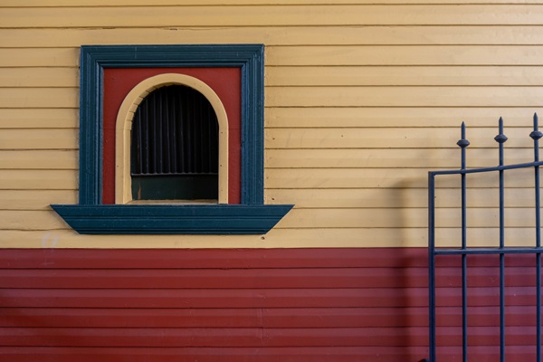
Extremely Dark Hues
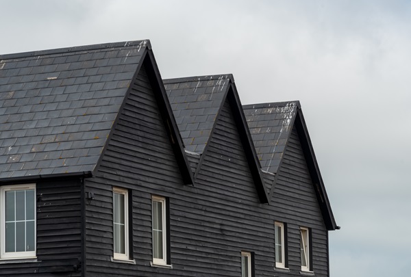
Dark colors might seem like a sophisticated and bold choice for an exterior; however, they come with practical drawbacks. Extremely dark hues absorb more heat, leading to increased cooling costs and discomfort during warmer months. These colors also show signs of fading and wear more quickly than lighter shades, meaning more frequent maintenance and repainting are often necessary to keep the home looking its best.
Additionally, dark-painted exteriors can make a house appear smaller and less inviting. They can overpower architectural details and make the home feel imposing rather than welcoming. In neighborhoods where lighter and more neutral tones prevail, a dark-colored house can stick out awkwardly, potentially affecting not just your home’s aesthetic appeal but also its harmony with the surrounding community.
Neon and Fluorescent Colors
Neon and fluorescent colors are exceedingly rare in residential exteriors and for a good reason. These colors are incredibly bold and can create an unsettling and unattractive visual experience. They are more suited to commercial advertising or art installations than the siding of a house. These colors can make a home appear unsettled and out of place, causing a distraction to passersby and neighbors.
The use of such intense colors can also reflect poorly on the homeowner, giving off an impression of tastelessness or a lack of consideration for the neighborhood’s aesthetic. Over time, the novelty of a neon color fades, leaving the homeowner with a color that is difficult to repaint and may reduce the overall appeal and value of the property. Moreover, these colors can be challenging to complement with landscaping or other exterior elements, often leading to a disjointed property appearance.
Stark White
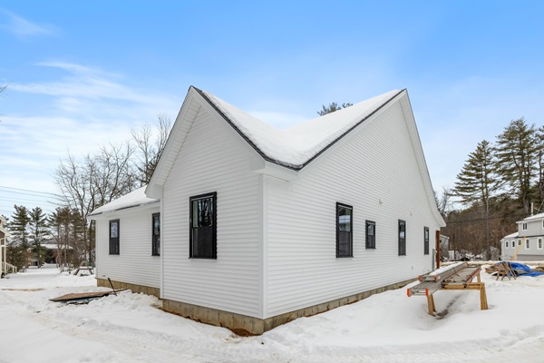
While stark white may seem like a safe and classic choice for a home exterior, it comes with its set of challenges. White exteriors can show every speck of dirt, dust, and imperfection, requiring frequent cleaning and maintenance to keep the house looking pristine. This is especially problematic in areas with high dust, pollen, or urban pollution, where the facade can quickly look dingy and uncared for.
Moreover, stark white can sometimes appear too harsh under bright sunlight, lacking the softness and warmth that make a home feel inviting. It can also starkly contrast with natural surroundings, making the home stand out more than blend in. Choosing a slightly off-white or a warmer, muted tone can provide the benefits of a light color—such as reflecting heat and lightening up the property—without the high maintenance and starkness of pure white.
Mismatched Colors
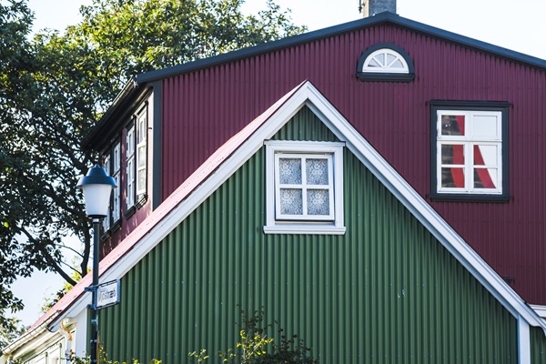
Choosing colors that clash with your neighborhood’s overall aesthetic can negatively impact your home’s curb appeal and decrease its value. When a house is painted with a color that starkly contrasts with its surroundings, it doesn’t just stand out; it can become an eyesore. This is particularly crucial in neighborhoods with specific guidelines or where there is a cohesive architectural style. Selecting a color that harmonizes with nearby homes doesn’t mean sacrificing personality but rather finding a balance that respects the community’s character while allowing some individual expression.
Additionally, mismatched colors can lead to conflicts with neighbors and even legal issues in communities with strict homeowner association rules. Before deciding on an exterior color, consider taking a walk around your neighborhood to observe the prevailing color schemes. Consulting with a design professional or neighborhood association can also provide valuable insights into color choices that will complement the area while aligning with your personal style.
Metallic or Reflective Colors
Metallic or reflective paints might seem like a unique and modern choice, but they can create practical and aesthetic issues when used on home exteriors. These finishes can produce a significant glare, especially in sunny climates, causing discomfort to neighbors and passersby. The reflective nature can also detract from the home’s architectural details, obscuring the beauty of its design under a shiny veneer.
The unusual appearance of metallic or reflective colors can also make a home stick out uncomfortably in a residential setting. While these finishes may work well for commercial or artistic settings, they typically don’t translate well to residential areas. If you’re drawn to the idea of a unique finish, consider using it on smaller elements like trim or doors rather than the entire exterior, or explore other special finish paints designed specifically for residential use that offer a unique look without the problematic glare.
Fad Colors
Fad colors come and go, and what’s trendy today might become a decorating faux pas tomorrow. When it comes to your home’s exterior, opting for a trendy color can lead to quick regret, as these hues often don’t age well. As trends change, your home can appear outdated, and you might find yourself needing to repaint sooner than expected to keep up with the times or restore a more timeless look.
Choosing a paint color for your home’s exterior is a significant investment, and it’s wise to select a hue that you’ll be happy with for years to come. Neutral and classic colors tend to stand the test of time and offer better versatility for changes in landscaping, roofing, or future home additions. If you love a particular trendy color, consider using it as an accent rather than the main color or incorporate it through easily changeable elements like front door paint or shutters.
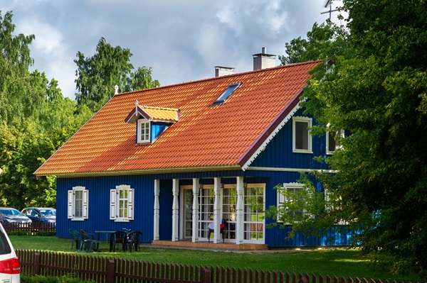
Overly Complex Color Schemes
An overly complex color scheme can overwhelm the eyes and detract from your home’s architectural beauty. While it might be tempting to use multiple colors to highlight different features of your home, too many hues can lead to a chaotic and disjointed appearance. A well-chosen color scheme should enhance the home’s best features and create a sense of harmony and balance.
When selecting colors for your home’s exterior, it’s generally best to stick to a maximum of three colors: one for the main body, one for the trim, and another for accents. This approach helps create a cohesive look that highlights the home’s design rather than overpowering it. Consulting with a color specialist or using color visualization tools can help you see how your color choices will look when applied to the entire house, allowing you to make adjustments before committing to a scheme.
Make a Smart Choice for Your Home’s Exterior
As you consider repainting your home’s exterior, remember that the right color can significantly enhance curb appeal and property value, while the wrong choice can lead to regret and extra expense. Avoid the pitfalls of flashy, dark, neon, or overly personalized colors, and instead, choose hues that will stand the test of time and complement your home’s natural setting. Consult with professionals, consider your neighborhood’s palette, and make a choice that you’ll be proud to come home to for years to come.