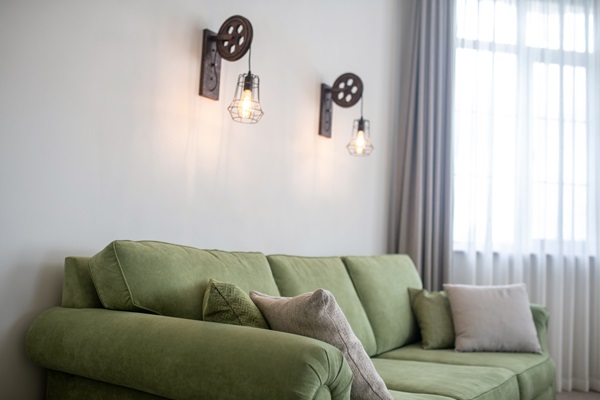
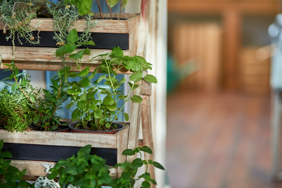
The 60-30-10 rule is a timeless principle in interior design, revered for its ability to create visually appealing and balanced spaces. This simple rule divides a space’s color scheme into percentages of 60%, 30%, and 10% – the dominant, secondary, and accent colors, respectively. This approach simplifies choosing a color palette and ensures a harmonious blend of hues that can transform any room from mundane to extraordinary. Whether redecorating a quaint studio apartment or a sprawling mansion, understanding and implementing the 60-30-10 rule can achieve a cohesive and stylish look.
Contents
Understanding the 60-30-10 Rule

The 60-30-10 rule is more than a random division of colors; it’s a guideline for creating a balanced and harmonious space. The dominant color, accounting for 60%, sets the room’s overall tone. It’s typically a neutral or subdued hue that serves as a backdrop. The secondary color, making up 30%, adds more character and depth. This color can be slightly bolder but should still complement the dominant color. The final 10% is where creativity shines – the accent color. This is where bold and bright colors make their mark, bringing life and energy to the space. This trio of color proportions ensures a balanced visual weight in any room, preventing any single hue from overwhelming the others.
The 60-30-10 rule can be adapted to suit any style and preference. For instance, a living room might feature light beige walls (60%), blue-gray sofas (30%), and vibrant yellow cushions and artwork (10%). This combination balances calm and excitement, creating an inviting and dynamic space. The key is to understand the role of each color percentage and use it to create a cohesive look that reflects personal style and room functionality.
Selecting Your Dominant Color – 60%

Choosing the dominant color is the first and most crucial step in implementing the 60-30-10 rule. This color will cover most of the room, including walls, large furniture, or flooring. It’s important to choose a color that reflects the desired ambiance of the room – soft blues or greens for a calming effect or warm neutrals for a cozy feel. Additionally, factors like room size and natural lighting play a significant role. Lighter colors can make a small room feel larger, while darker hues create a more intimate atmosphere in a spacious area.
When selecting the dominant color, one should also consider the room’s existing elements, such as flooring or large furniture that won’t be changed. These elements should harmonize with the chosen color to create a seamless look. For example, a room with dark wood flooring may benefit from a lighter dominant color to create a balanced contrast. Ultimately, the dominant color sets the stage for the room’s overall mood and style, making its selection a pivotal decision in decorating.
Integrating Your Secondary Color – 30%

The secondary color in the 60-30-10 rule bridges the dominant and accent colors, adding depth and interest to the space. This color often appears in textiles like rugs, curtains, and upholstery, as well as in secondary furniture pieces. While it should complement the dominant color, it can be more adventurous and vibrant. The secondary color can shift the room’s ambiance, making it crucial to choose wisely.
For instance, if the dominant color is light gray, navy blue can serve as an excellent secondary color, offering a sophisticated contrast while maintaining harmony. It’s essential to distribute this color evenly throughout the room to create a sense of balance. This could mean navy blue chairs, a rug with blue elements, or drapes incorporating the color. The goal is to weave the secondary color throughout the room to tie everything together without overpowering the dominant hue.
Choosing Your Accent Color – 10%

The accent color is where one can truly express personality and style. This 10% is reserved for small decorative elements like cushions, artwork, and decor items. An accent color can be bold, bright, and daring – it’s the element that can bring a sense of excitement and surprise to a room. However, using this color sparingly is important to maintain the room’s overall balance.
Choosing the right accent color depends on the existing color scheme. It should stand out against the dominant and secondary colors, creating a focal point in the room. For example, in a room with a beige (60%) and brown (30%) color scheme, a pop of turquoise or coral can add a lively contrast. The placement of accent elements is also key; they should be spread throughout the room to draw the eye and create visual interest. This strategic use of color adds depth and dimension to the space, making the accent color a powerful tool in interior design.
Combining Textures and Patterns

While the 60-30-10 rule primarily focuses on color, integrating textures and patterns is pivotal in enhancing the overall aesthetic. Textures add depth and layers to a room, making it more visually interesting and inviting. For example, a room with smooth, matte walls (dominant color) can be complemented by a velvet sofa (secondary color) and silk cushions (accent color). This variety in textures adds richness to the space without altering the color proportions.
Patterns also contribute to the room’s character. When incorporating patterns, it’s crucial to maintain color balance. A large, patterned area rug in the secondary color can tie the room together, while small patterned accents in the 10% range can add pops of interest. The key is to ensure that the patterns harmonize with the overall color scheme and don’t clash. A mix of larger, bolder patterns and smaller, more subtle designs can create a dynamic yet cohesive look.
Lighting and the 60-30-10 Rule

Lighting is an often overlooked but essential factor in interior design, especially when applying the 60-30-10 color rule. The right lighting can enhance the colors and create the desired mood in a room. Natural light tends to bring out the true colors, so it’s important to consider how colors look at different times of the day. From ambient to task lighting, artificial lighting can highlight different room parts and shape the color scheme.
For instance, warm lighting can accentuate warm dominant colors, making a room feel cozier, while cool lighting can complement cooler tones, creating a more serene environment. Accent lighting can draw attention to the 10% color, like illuminating a piece of art or decorative objects. Thus, the choice and placement of lighting should be in tandem with the color scheme to fully realize the room’s design potential.
The Bottom Line
The 60-30-10 color rule is a fundamental principle in interior design, offering a simple yet effective framework for creating balanced and harmonious spaces. By understanding the role of each color percentage and incorporating textures, patterns, and lighting, one can transform any room into a beautifully curated space. However, it’s important to remember that this rule is a starting point, not a strict directive. Avoiding common mistakes and experimenting with colors and personal style can lead to unique and personal spaces. Whether redecorating a single room or an entire home, the 60-30-10 rule provides a solid foundation for exploring the world of color and design.


